Sunday, March 26, 2017
Saturday, March 25, 2017
Evaluation : Question 3 - Skills Development

Codes and conventions:
Prior to this assignment I was not familiar with the codes and conventions of films at all, let alone thriller films. Thriller was never my favourite genre to watch as it is too scary for me, however after being given this task I began watching more thrillers as it would to give a rough idea of how the micro-elements conveyed the thrilling mood. Some thriller films that I watched were the Zodiac (2007), Mr. & Mrs Smith (2005), The Shallows (2016) and Inferno (2016), alongside these films I also watched the film Children of men (2006) a science fiction film. Watching thriller films and non-chiller films allowed me to compare the difference in the micro-elements and how the messages are conveyed to give the audience a certain emotion.
Planning and organisation:
We began planning our film opening in December of 2016 which gave us 3 months to plan, film, edit, present our rough cut to the class and reflect back on the feedback received. The planning process took longer than we had anticipated as we researched on which film opening we liked best and how we could adapt ideas so it would be suitable for ours. Our filming and location scouting process was done within 2 days which I thought was a very efficient use of our time. We were able to film in a short span of time as we had plan which shot we wanted to get and what to look for at the filming location before going to film.
Camerawork:
My camerawork has improved the most as I research on how to film particular shots which allowed me to experiment with the filming equipment we had at the time.

Visual Effect:
I began this project without any idea of what visual effect meant as well as how to create them. I was personally taught the way on how to add the vignette by Eye as she learnt from a video on youtube. In the shot which our title is shown, the text was added using After Effects. I also used youtube to find tutorials to do this which allowed me to explore other tools on the application.
Editing:
I only had experience using iMovie which is a very basic application. Throughout creating this assignment I learnt how to edit simple things such as putting clips together as well as creating key-frames. Along this I also learnt how to colour correct which transformed the lighting and the mood of our opening. We often worked on one laptop and discussed the choice of the lighting and the narrative structure of the clips.
Creative Confidence:
At first I had some difficulty coming up with ideas on how I wanted our outcome to look, however as I looked at examples of thriller openings and discussing with Claire and Eye we came up with an idea. Claire, enjoys the genre of thriller and horror which meant she was able to give us ideas of the what our psychological thriller is trying to convey. We each gave ideas of what we thought might work and whether we would be able to find the props. Some ideas were rejected and the rest made it to our final opening.
Thursday, March 23, 2017
Evaluation: Question 2 - Distribution
How would it be distributed as a real media text?
 As our film is presumably going to be on a niche market and it is based on the theme of how society perceives beauty leading to psychological issues a specific standpoint. Therefore, our film may not appeal to a large group of people in comparison to blockbuster films. We would enter our film into a film festival possibly the Screamfest Horror Films Festival since it aims at fans of horror films which thriller is similar to. The audience at the film festival would directly be our target audience as they already are fans of a similar genre, who would possibly give word of mouth recommendations to people they know increasing the exposure of our film "Skin".
If Skin was to receive an award at the festival a "buzz" would be created meaning there will be critics who would review our films on sites such as the Roger Ebert website. Film critic websites consumers are most likely fans of movies, ergo our film is more likely to appeal to them compared to someone who does not watch films. This could help to broaden our group of audience and increase the reputation of the production company.
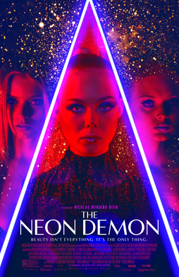
 In addition, we would work with the distribution and production company Broadgreen Pictures which specialises in motion pictures and independent films with a specific audience type. The production company also has had years of experience and is responsible for the films The Neon Demon (2016), Green Room (2016) and Wish upon (2017).
The film The Neon Demon is very similar to our film since it is also a thriller as well as a low budget film of $7 million. The film The Neon Demon was co-distributed by Amazon Studios who distributed the film through Amazon video, an online streaming site. Our film could also be distributed by Amazon studios in order to be seen by internet users.
Our film would be released in Theatres during October as the Halloween celebration would provide the perfect gloomy environment to watch our film.
To possibly reach out to younger audiences, our film could be release on other online streaming sites such as Netflix, iTunes and Hulu plus. Online streaming sites are very common in young teens as it is inconvenient for them to travel to the cinema.

If Skin was to receive an award at the festival a "buzz" would be created meaning there will be critics who would review our films on sites such as the Roger Ebert website. Film critic websites consumers are most likely fans of movies, ergo our film is more likely to appeal to them compared to someone who does not watch films. This could help to broaden our group of audience and increase the reputation of the production company.
The film The Neon Demon is very similar to our film since it is also a thriller as well as a low budget film of $7 million. The film The Neon Demon was co-distributed by Amazon Studios who distributed the film through Amazon video, an online streaming site. Our film could also be distributed by Amazon studios in order to be seen by internet users.
Our film would be released in Theatres during October as the Halloween celebration would provide the perfect gloomy environment to watch our film.
To possibly reach out to younger audiences, our film could be release on other online streaming sites such as Netflix, iTunes and Hulu plus. Online streaming sites are very common in young teens as it is inconvenient for them to travel to the cinema.
Evaluation: Question 2 - Target audience
How does your product engage with audiences?
Our film opening is most likely to have a niche target audience who are interested in psychological thrillers combined with the obsession of beauty. This may mean that women will be more interested in our film since the main purpose of our opening shows the extreme extent of an obsession to beauty.
Our film opening is most likely to have a niche target audience who are interested in psychological thrillers combined with the obsession of beauty. This may mean that women will be more interested in our film since the main purpose of our opening shows the extreme extent of an obsession to beauty.
Here I used the website yougov.profiles to explore the target audience of thrillers and films which may have similar elements to our film opening. The results I selected shows the demographics, annual income, professions and personality of the main audience of the films.
Analysis of Yougov.profile results:
From the results I found that most people who are watch the films are 30 years old or older. This may be because those who are younger find the imagery too graphic or violent for their preference. People who are younger may also have less time to watch films as they are still in school. The annual income of the majority of the audience varies from less than $20,000 to more than $100,000 which means that the genre thriller attracts people of all income levels. I also noticed that 3 out of the 4 films I have selected, the audience is involved in Arts which may result in them enjoying the enigmas allowing them to think creatively and imagine all the solutions to the enigmas.
This is our ideal target audience for our film:

I chose to focus our target audience on women as I saw an opportunity in the consumer market since the majority of audience who watch thriller films are men. Targeting on women would result in less competition in the market for movies based on the idea of the perception of beauty and taking an obsession of beauty to an extremity. Since the antagonist a woman and her target protagonist are also women, female audiences may be able to understand the antagonist's thoughts better resulting in a more effective film.
Evaluation : Question 1 - Representation
How does it represent social groups or issues?
A persons appearance plays a large role on how they fit into their social life. Our film opening shows a representation of a woman's dissatisfaction with her looks as she age which causes her to act to an extreme level, murder. We chose to base our character on a women as they are the majority of people who go into facial manipulation and are affected by the opinion that society has of them. As our group consisted of 3 girls we thought this idea of looking beautiful to satisfy society also applied to us.
Furthermore, society nowadays have a perception of the "perfect" women who looks like the front cover of a magazine. In reality the photos have been manipulated as scar, stretch marks and wrinkles have been erased. This idea is represented in our film by the collage board where the antagonist cuts up faces of celebrities who she see as beautiful to form her own plan of a perfect face, by which she executes by murdering younger girls and uses their skin on her own body to hide her flaws.
Example of magazine covers we see today:


The woman's character has been similarly executed in reality by a french artist called "Orlan" who
uses her own body and plastic surgery to make "carnal art". She transforms her face to contradict the commonly standard of beauty. Although in the film opening the women does not challenge the standard of beauty but rather goes along with it as the character is fixated with becoming beautiful. However the message that the film opening/movie is trying to convey is the same, that is showing the extent that a person can go if they listen to the perception that society has of beauty and why people should not follow what society says.
 |
| An artwork by Orlan |
Monday, March 20, 2017
Evaluation : Question 1 - Conventions
How does your product use of challenge conventions:
Convention: the generally accepted way of doing things/ what the audience expect to see.
Common conventions of thriller which was used in our film opening and is expected in our "film":
- The antagonist ensnares the protagonist in an increasingly complex web, until the protagonist feels isolated and helpless.
- The narrative centres upon a crime E.g theft, murder
- A series of enigmas are set up - only to be solved at the end.
- The narrative presents extraordinary events in ordinary situations/ settings.
- The micro-elements are used to build suspense

The location is established in this shot. The room can be seen with a simplistic layout, which is common in most apartments. It provides the idea of an ordinary situation which the audience can easily relate to. This is common in thrillers as it is one of its conventions.

This panning shot of the credits was inspired by the credit sequence of the film How to kill a Mocking Bird (1962). In the credit sequence of the film, an extreme close up is used to show small details that contribute to the storyline of the movie. We used this idea to creatively show our credits by a panning shot of the woman's desk and her collage board, which helps to tell the story of who the woman is and what differs her from normal people.

The idea of a murderer's "planning board" is rather common in thriller films as it allows the thoughts of the murderer to be revealed to the audience. The murderers board often also show what the character is planning to do and is used as an action code.
Here are some scenes from other films which I explored as a reference to this scene for my film opening.
 |
| A scene from Luther Series 3 episode 1 |
 |
| A scene from Ex-Machina. |
 |
| A scene from American Psycho. |

The fonts are presented in white as it creates a contrast between darker shadows and the text itself. We chose the font New Times Roman since it was easy to read. The shape of the text signifies the woman's prosperity as the font appears very traditional and classic.

'


In this last shot an aftermath of a murder is shown. This concept is inspired by the film Se7en (1995) in which the act of murder is not seen until the murderer is revealed at the end of the movie. Similarly, throughout our opening the audience is given hints of who the woman is, her method and her motivation of killing along with the mis-en-scenes the enigmas are unraveled.
Another film which uses a similar idea of showing the aftermath prior of the murder prior to the act of murder is the film Taking Lives (2004). The opening scene ended with an enigma of "What has the man just done?" "Why did he have to kill the other character?". We used the same method of ending the opening on a cliffhanger to keep the audience engaged and wanting to watch the rest of our "film".
Wednesday, March 1, 2017
20. Peep Hole Effect
As we were influenced by the film opening of American Horror story we attempted to film a peep hole effect at the hotel we filmed at. However this shot was not included as there we difficulties during the filming and editing process such as aligning the lighting between the two different shots.
Our footage also turned out to be very noisy which we thought was a distraction.
American horror story peep hole shot.

This is our unfinished attempt of the peep hole effect.
Our footage also turned out to be very noisy which we thought was a distraction.
American horror story peep hole shot.

This is our unfinished attempt of the peep hole effect.
Tuesday, February 28, 2017
19. Vignette
To add darkness and detail to the footage, we experimented with adding a vignette around the clips. This made sure that the focal area was in the centre of every clip and the audience is not distracted by any unwanted details. The aim of this was to create a cinematic looking video.
This was the tutorial Eye used:
This was the tutorial Eye used:
The effect was not very visible in the opening as the clip was already dark however I thought it worked really well on shots of the desk panning as the footage blended into to the rest of our opening better.
Monday, February 27, 2017
18. Choosing a Font
Me, Claire and Eye each worked on separate laptops in order to use our time efficiently. On my laptop I edited the transitions of the title, experimenting with different fonts which Eye found. In the meantime Claire worked on the rest of the credits and choosing the font. First and last names was needed along with roles/position of each person. We discussed on the font which was used in both the credits and the title making sure that all of us were happy with the chosen font.
We added special fonts to our laptops by using the website http://www.dafont.com , downloaded the font into our laptops and added the fonts to After Effects by using FontBook.
This is the tutorial I used for the transition of the title, however this effect is not as visible in our opening as it is in a much smaller scale.


We added special fonts to our laptops by using the website http://www.dafont.com , downloaded the font into our laptops and added the fonts to After Effects by using FontBook.
Title
After changing our title post editing our rough-cut and receiving response from our classmates, we also had to change our choice in fonts which were initially chosen to be used for the title "Limerence". Throughout this process, I realised that the choice of font does has a large impact on the vibe that the word gives.This is the tutorial I used for the transition of the title, however this effect is not as visible in our opening as it is in a much smaller scale.
Here were our consideration of fonts:
We wanted the font to look imperfect as it reflects the main character's mental state.
We wanted the font to look imperfect as it reflects the main character's mental state.


Our final choice of font: Splendid 66 by Johan Holmdahi

 |
| A screenshot after showing adjustments to the mask and stabilising the footage. |
Credits
Claire and I coincidentally stumbled upon the same opening which we both really enjoyed its simplicity. As a result we used it as a reference for our credit transitions and positioning.
Here were some font considerations for the credits:


After a discussion we all agreed that these font didn't look right. Claire experimented with default fonts on her laptop and found the perfect one. Times New Roman
The settings she used were :
Font size : 48 (name)
25 (roles)
Opacity : 45%
 |
| A screenshot from Claire's laptop. |
Sunday, February 26, 2017
17. Title Change
We decided to make changes due to various reasons, one being the result of our class feedback. From the feedback we found that most people had an unclear and vague idea of what our film opening was leading to. We believe the name "Skin" gave a clear connection between the cut-outs of the magazine and the meaning created throughout our opening. The word skin also has connotations of gore and age.

The second reason in our change of title is our audience not knowing what the word "Limerence" means, as it is an uncommon word.
Here is a video of our classmate's and teacher's response to the question
"Do you know what Limerence means?"

The second reason in our change of title is our audience not knowing what the word "Limerence" means, as it is an uncommon word.
Here is a video of our classmate's and teacher's response to the question
"Do you know what Limerence means?"
Saturday, February 25, 2017
16. Class Feedback (1)
From the rough cut we also received responses from our classmates of what they liked, disliked and whether they have seen something like this before if so from where.


What we will do as a response to the feedback:
- Colour grading
- Make the credits become clear by
- Adding digital typed up text
- Re-film the collaged credits making sure to include the full name
- Possibly change of name to clarify the message in the opening
15. Rough cut
We assembled a rough cut to give us an idea of which shot was going to be used where and whether we had to make changes to our sequence.
Here is our rough-cut:
Here is our rough-cut:
Friday, February 24, 2017
14. Primac Productions
Eye made the title opening which was then put together with the rest of the edits.
The video clip we used for the sound:
This was her process:
We chose the name "Primac" as the word Prima has a good meaning in multiple languages as well as being common in names of company.
The font used was Trajan Pro 3. We liked this font because it looked modern while looking elegant at the same time.

At first we chose the sound of a clock ticking as it signifies that time is running out as our character is getting older. This is the production title with the sound of the clock ticking.

At first we chose the sound of a clock ticking as it signifies that time is running out as our character is getting older. This is the production title with the sound of the clock ticking.
Due to the changes in our actress the concept of the old women ageing was not as strong, as a result we decided to change the production title background music.
This is the sound clip we used:
We thought this sound clip worked better as it helps to set the thriller mood more effectively.
This is the final production title:
This is the final production title:
13.5. Filming day
As we arrived at our filming location which we found a day in advanced we began to set up the lighting, adjusting our filming equipment and preparing Claire for her character as the woman.
Here is a time-lapse of Eye doing Claire's makeup as she has done SFX before as a hobby. I helped in applying fake stitches as Eye instructed me.
Here is a time-lapse of Eye doing Claire's makeup as she has done SFX before as a hobby. I helped in applying fake stitches as Eye instructed me.
We decided that Claire would wear this green vintage looking dress as she already owned the item which meant that we did not have to spend any money on finding a dress. As the dress already looked vintage this fits perfectly with the character of the old lady we are trying to portray.
We filmed the peephole shot first (which we ended up not using), the desk panning shot, followed by Claire's back, her walking to the away and lastly the scene in the bathroom.
Here's a time-lapse I filmed using my go pro:
13. Sequence Idea : 2
Our intentions in creating the film opening is to create suspense by gradually revealing information about the character. In doing so we made changes to our initial sequence due to the location we were at and the equipment we had at the time of our shoot.
- Camera slowly zooms into a hallway, a swift turn to a room door.
- In one lesson we discussed our choice of lighting for the opening scene. We chose a blue/cold lighting as it provided a better sense of discomfort when compared to yellow/warm lighting.
- Here are some pictures that Eye found during our discussion.
- Zooms into the peephole of the door where a glitch effect is used and a women working at her desk can be seen.
- Camera pans her desk, on it the audience can see numerous beauty products. Camera continues to pan onto display where the audience can see a number of magazine cut outs. Diabetic sound of pencil scribbling and paper being cut.
- The women walks to the bathroom (this is shown by multiple angles of the women walking). The lady stands in front of the mirror, parts of her face is shown by close up shots. This reveals cuts and wrinkled skin.
- Cut to shot of her hands running through her white hair and she looks into the mirror. Her facial expression is shown in the reflection, an unsatisfied face can be seen.
- An extreme close up shots her pulling a strand of white hair, this shows the tension of the skin being pulled. (provides a sense of disgust)
- The lady walks out of the bathroom (this is shown by a wide shot). As she walks out of the bathroom a body/leg covered in blood is seen hanging out of a bath tub.


This is a video of us drawing the story board. However there were some difficulties with film which made the clip shorter than we would have liked.

Thursday, February 23, 2017
12. Props: Collage board
On the day of our location scout, we also went to Eye's house to create the Collage board which is one of the main components of our film opening.
Here is time-lapse of us making the collage board which was used the following day.
Here is time-lapse of us making the collage board which was used the following day.
Wednesday, February 22, 2017

Monday, February 20, 2017
10. Finding Filming Location
On the 21st January we went location scouting around the Ari district (nearby Eye's house). At the start we had planned to film at Eye's old house, however the arrangements of the furniture in the room was not what we had in mind as well as the house being too new looking. Using a room at Eye's house also meant that we weren't able to film the peephole shot. As a result we looked for local hotels and decided to spread out filming and location scouting over two days as this would allow us to explore more location options.
Eye edited a vlog which I filmed during the day with my Gopro:


Here was one of the other hotels we looked at:
Pradipat hotel : 900 Baht/night

Elizabeth Hotel : 1000+ Baht/night

The hotel we filmed at:
Bangkok Condotel : 1000 Baht/night
We stumbled upon this hotel while we were on our way to Elizabeth Hotel. When we arrived by taxi the Elizabeth Hotel exterior looked newer than we had expected, we immediately realised that the interior would be new too meaning a higher price of stay which we didn't want. We decided to look nearby for smaller hotels and we found Bangkok Condotel.


9. Our schedule
Eye created a schedule for location scouting day and or filming day. This made sure that we finished our film opening by the deadlines.
Location scout: 21/01/17
Filming day: 22/01/17

Location scout: 21/01/17
Filming day: 22/01/17
 |
| The timetables which Eye made. |


7. Diegetic and Non-Diegetic sounds
Here are the sounds which was chosen after a discussion:
Non-Diegetic music:
Non-Diegetic music:
Diegetic music:
Paper scribbling
Paper scribbling
Paper cutting
Water droplets
6. Casting
Our initial actress requirements were:

Unfortunately Tan was very busy with school work during the week we were filming. As a result we spontaneously had to change our actress to Claire.

Claire Lu (Claire)
Claire kindly stepped into to play our main character as she has 2 out of 3 of our requirements. We also decided that using an asian actress would give a unique feel to our opening.
- Hispanic: we referenced from thriller genre films such as Mama(2013) and Julia's Eyes(2010) in which we found that hispanic actresses and actors were very successful
- Thin: this would make it easier for us to enhance the bone features for the backchat where we see the spine
- Long haired: provides a sense of secrecy in shots where hair partially covers the character's face
Our chosen cast:

Tailia Boonkul (Tan)
Unfortunately Tan was very busy with school work during the week we were filming. As a result we spontaneously had to change our actress to Claire.

Claire Lu (Claire)
Claire kindly stepped into to play our main character as she has 2 out of 3 of our requirements. We also decided that using an asian actress would give a unique feel to our opening.
5. Inspiration : Fonts and credits
Here we found examples of fonts in film opening of both we liked and dislikes to see what elements of the different types works and which didn't. By doing so we are able to adapt elements which we liked into our own film opening.
Silence of the lambs

- White boarder around the text makes it become cartoon like.
- Bold, does not blend in with the background
- The position of the text mean the intention was for it to standout
Examples we enjoyed.

- The spaceship toy has connotations of what the film may be about
- The text blends in with the colours present in the shot.
- The font which we assume is Linotype Didot® is crisp and clear. Which provides an elegant feeling.

- Monochromatic
- Clean and crisp
- Close up shots builds up to the overall image
- Simple font - goes along with the theme of the film opening/film
Subscribe to:
Comments (Atom)